Color day is finally here!!! We are going to add color to our pages now that your rough drafts are laid out. In class, I'm going to talk to you guys about color theory and color harmony. Colors, like shapes and text, can look very overwhelming if you use too many colors. We want to avoid colors that contrast a lot right next to each other, so by learning color Harmony our pages will look very unified.
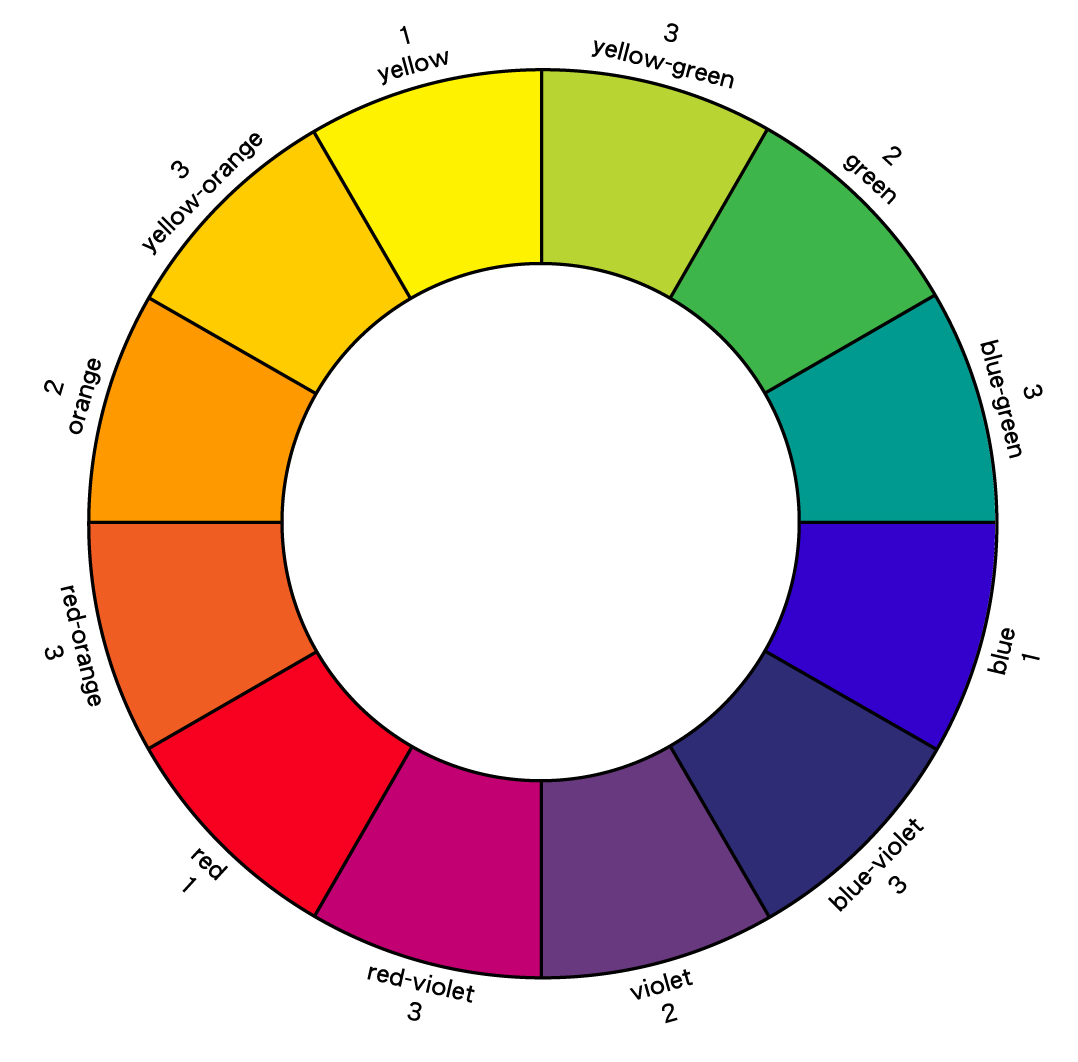
When it comes to color, we will be masters of the color wheel! The color wheel is a wheel of all the colors.
The primary colors: Red, Blue, and Yellow
The secondary colors are a mix of the primary colors: Green, Purple, Orange.
The tertiary colors are in between the secondary and primary colors: Red-orange, yellow-green, blue-purple, etc.
These are all the colors on the color wheel.
A color scheme (or palette) is taking multiple colors from the color wheel to use. There are many different color schemes to use.
Primary, secondary, and tertiary are all color schemes on their own, listed above. Here are more below.
Complimentary colors: Colors opposite to each other on the color scheme. (red/green, blue/orange, and purple/gold) Colors that are complimentary have the most contrast when put right next to each other since they are opposites. They can be hard on the eyes if used together. A way to make compliments less harsh, is to put a brown in the color scheme. If you mix complimentary colors, they turn into neutrals (browns.) I would avoid complimentary colors as a theme for your page. Instead try complimentary analogous! (seen below)
Analogous: Color that are right next to each other on the color wheel. (red, red-violet-violet,blue-violet) They are side by side colors and give a nice transition on hues on your page. The only thing to really avoid with analogous colors is going all the way around the color wheel. You'll get a full rainbow which might be too many colors at once.
Complimentary Analogous: Is a color scheme that takes a complimentary color scheme like red/green and adds one analogous color to it. (red/green/green-blue) In this example, Blue-green is an analogous color to green, yet we still have the complimentary color red in this color scheme.)
Split Complimentary: You take a complimentary color, such as red and you go across the color wheel to green. But, instead of using green, you use the analogous colors to green and leave green out of the color scheme. (red, green-blue, yellow-green)
Cool Colors: Cool colors are green, blue, violet (and everything in between)
Warm Colors: Warm colors are red, orange, yellow (and everything inbetween)
For your pages, you will have to choose a color scheme you want to do and add the design feature on your page. We will talk about this design feature in class. Adding color to the pages will take today and tomorrow and this assignment is a check off grade. Everyone should have the color feature on their pages.
You are also allowed to change the color of your header on your page. Make sure that the color of your header makes sense to your color scheme of the page! Avoid colors that are too light for your header, such as yellow. Yellow font blends into the white around it that sometimes that it becomes unreadable. Choose any other color other than yellow.
Points for color check off: 10
 RSS Feed
