Congratulations to those that finished the pixel art assignment. For those that are done, we are going to start a new assignment called the halloween poster assignment. I don't care if this assignment goes past Halloween, that's alright with me. I want to have this assignment so that we can learn blending modes for layers.
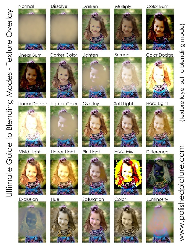
If you go to your layer menu on photoshop, you will see that right under the layer tab there is a drop box tab that says normal. If you click on that tab, there will be along list of layer effects to choose from. It's a lot like filters for photos that are similar to Instagram, only more intense. At the very end of this page is an example of all the layer effects in action. On the normal layer example, there is a texture that is being put on the girl. That texture layer is given the layer effect. Each effect does a different look. Some make the texture go in the image and look darker, like multiple and color burn for example. Other blending modes use the texture to make it look even lighter and more saturated, like overlay and vivid light. Then, you have your weird layer effect, like difference, which makes the girl opposite colors and very evil looking.
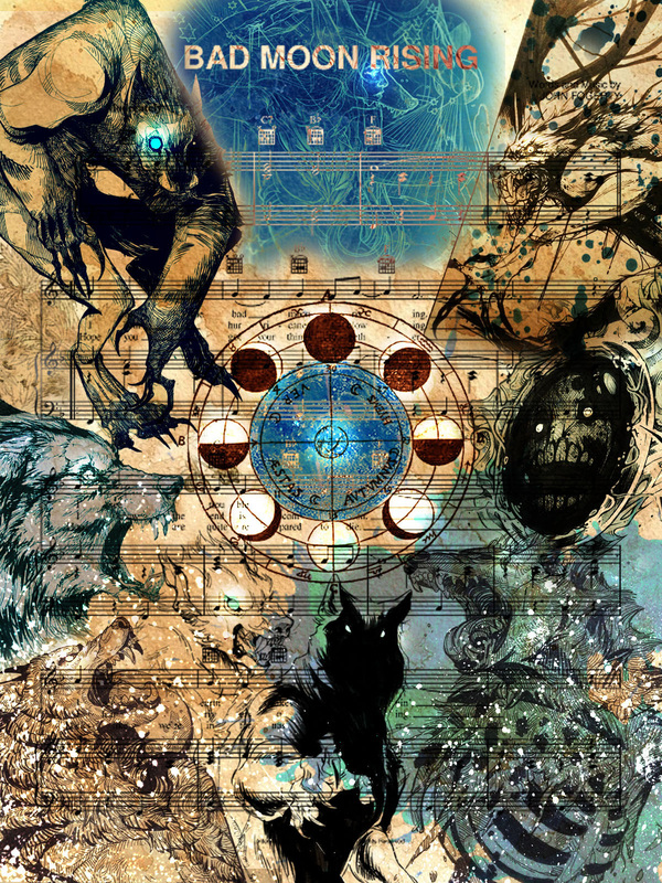
If you look at the image above, you will see that there are a lot of werewolves covering the page. All the werewolves are black and white drawings set on mutiply to blend into the paper background. The white of the werewolves disappears and is set to the paper texture. Divide blending mode is used for the moon in the center, the wolf woman in the top middle, and the 'blood splatters' to make them look blue. (of course, you can also use hue and saturation, but you won't get the same creepy effect like above) I used a white airbrush on it's own layer set to overlay to create a soft glow for the eyes and moon. The white ink splatter below is set to Exclusion to make it look white instead of black.
For this assignment, you will have to create a Halloween poster and use blending layer options all throughout your image.
1. You need at least 20 usable layers for this assignment. Usable layers means that you can't just have empty layers of nothing. Each layer has to have an image on it.
2. You need 8 layers to be on a blending mode. You need at least on to be on multiply, overlay. and divide/difference. The rest of the blending modes are up to you, so you can play around with them so you can see what looks right.
3. You have to pick a theme of focus. For example, above I picked werewolves as a major theme. If you want to pick a Halloween monster as a theme you can do so as well. (examples: vampires, zombies, mermaids, harpies, bigfoot, etc. If you don't have an idea to use, look up a list of monsters on wiki, they categorize them by type and powers) If monsters scare you, you can also make your halloween poster be more about the spirit of halloween. (trick or treating, pumpkins, scary movies/games, little dogs in happy costumes, whatever, you just need to choose your theme)
4. It has to be school appropriate! Sadly, with Halloween, people try to push the holiday to be too focused on gore/violence/sexy costumes. I will not anything like that for a grade, so don't get too gross, play it safe. A little blood is fine but if you show a person being ripped apart and eaten alive then I think you took it way too far.
5. You need a color scheme. The best posters use minimal colors for their illustrations. Look to the example above. I used blues and browns as my color scheme so that it didn't become too chaotic. There are many colors to choose from with your illustration. You can choose oranges for the fall season or you can choose red for a vampire page. Pick only one or two colors and your poster will look great!
6. Fill up every space of your poster with an image. You can't leave any empty white background in this assignment or have three characters floating in space. Fill it up will all sorts of images. (think collage)
Size: 1200Widthx1600Height pixels
Points: 20
Due Date: November 15th
If you go to your layer menu on photoshop, you will see that right under the layer tab there is a drop box tab that says normal. If you click on that tab, there will be along list of layer effects to choose from. It's a lot like filters for photos that are similar to Instagram, only more intense. At the very end of this page is an example of all the layer effects in action. On the normal layer example, there is a texture that is being put on the girl. That texture layer is given the layer effect. Each effect does a different look. Some make the texture go in the image and look darker, like multiple and color burn for example. Other blending modes use the texture to make it look even lighter and more saturated, like overlay and vivid light. Then, you have your weird layer effect, like difference, which makes the girl opposite colors and very evil looking.
If you look at the image above, you will see that there are a lot of werewolves covering the page. All the werewolves are black and white drawings set on mutiply to blend into the paper background. The white of the werewolves disappears and is set to the paper texture. Divide blending mode is used for the moon in the center, the wolf woman in the top middle, and the 'blood splatters' to make them look blue. (of course, you can also use hue and saturation, but you won't get the same creepy effect like above) I used a white airbrush on it's own layer set to overlay to create a soft glow for the eyes and moon. The white ink splatter below is set to Exclusion to make it look white instead of black.
For this assignment, you will have to create a Halloween poster and use blending layer options all throughout your image.
1. You need at least 20 usable layers for this assignment. Usable layers means that you can't just have empty layers of nothing. Each layer has to have an image on it.
2. You need 8 layers to be on a blending mode. You need at least on to be on multiply, overlay. and divide/difference. The rest of the blending modes are up to you, so you can play around with them so you can see what looks right.
3. You have to pick a theme of focus. For example, above I picked werewolves as a major theme. If you want to pick a Halloween monster as a theme you can do so as well. (examples: vampires, zombies, mermaids, harpies, bigfoot, etc. If you don't have an idea to use, look up a list of monsters on wiki, they categorize them by type and powers) If monsters scare you, you can also make your halloween poster be more about the spirit of halloween. (trick or treating, pumpkins, scary movies/games, little dogs in happy costumes, whatever, you just need to choose your theme)
4. It has to be school appropriate! Sadly, with Halloween, people try to push the holiday to be too focused on gore/violence/sexy costumes. I will not anything like that for a grade, so don't get too gross, play it safe. A little blood is fine but if you show a person being ripped apart and eaten alive then I think you took it way too far.
5. You need a color scheme. The best posters use minimal colors for their illustrations. Look to the example above. I used blues and browns as my color scheme so that it didn't become too chaotic. There are many colors to choose from with your illustration. You can choose oranges for the fall season or you can choose red for a vampire page. Pick only one or two colors and your poster will look great!
6. Fill up every space of your poster with an image. You can't leave any empty white background in this assignment or have three characters floating in space. Fill it up will all sorts of images. (think collage)
Size: 1200Widthx1600Height pixels
Points: 20
Due Date: November 15th
 RSS Feed
